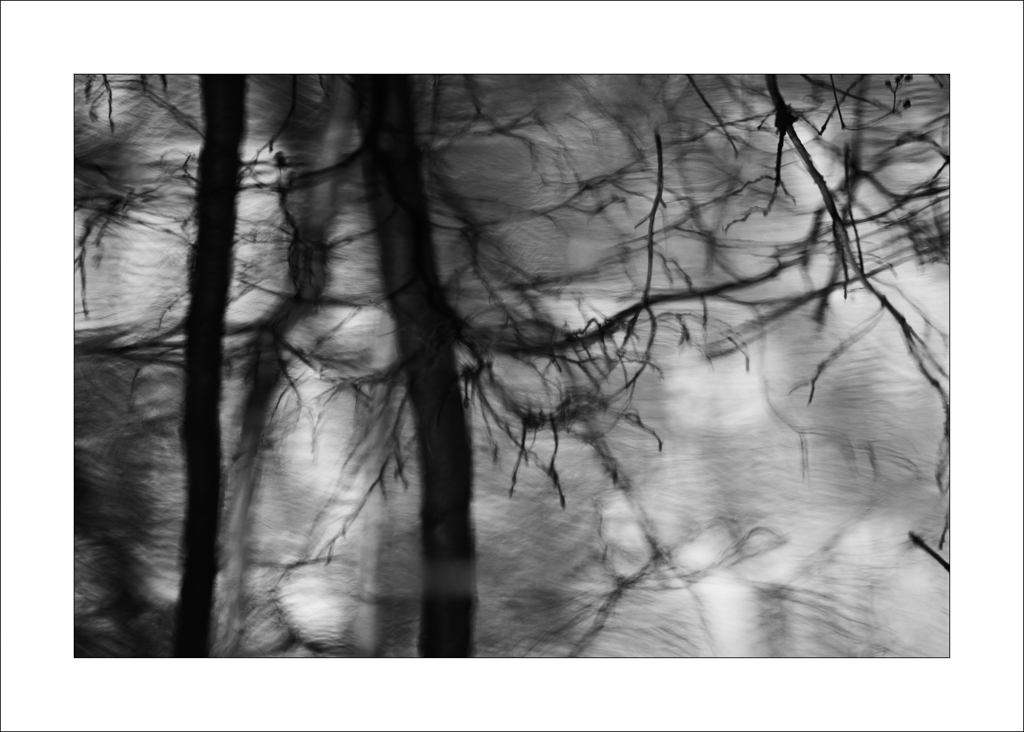
This set of photographs centres mainly on the wetland area in Clumber Park where the River Poulter feeds into Clumber Lake. This sounds quite dramatic but it is actually very gentle.
Much of the area is naturally overgrown and a haven for wildlife but the subjects that caught my eye were the details on the waters edge and in particular some of the reflections. Most of this I captured in black and white as this example image shows:
Before moving on to the reflections it is worth setting more of the context for these pictures using these photographs of the water's edge:
What can be seen in the above images is the way the branches reflect in the lake. Some are in bright open water and others closer to the bank have more darker areas. This led to two distinct panels of black and white photographs.
The first panel is characterised by gaining clarity between the reflected branches and the water which could be described as a high key finish:
The second panel takes the alternative low key approach creating a softer and more ambiguous representation of the reflections:
I find the low key panel more intriguing. The dark shadows and movement created by longer exposure times creates a mood that holds the attention longer than sharper or more defined higher key studies. That said, I find the first image in the higher key panel particularly engaging.
Finally, continuing the black and white theme is a small panel focusing on details at the waters edge. What I am trying to achieve here is a sense of elegance in the compositions.
Elegance often comes from simplicity of lines and in particular curves. The first image in this post is an example of lines creating a simple and possibly elegant composition - although this sense of elegance has been enhanced by the digital removal of some bubbles and other debris in the water. The original unaltered version is posted below along with some alternative compositions:
Whether digitally 'cleaning' images is considered acceptable depends upon your point of view and how the picture is being presented - there has been a lot controversy about the airbrushing of celebrities in magazines for instance.
As a predominately landscape photographer, I tend to remove only aspects of a scene that are considered temporary e.g. a distracting white van parked in the distance, a aeroplane's vapour trail in the sky or a piece of rubbish in the foreground. At the end of the day I doubt that anyone is going to get too worked up about the removal of debris around a blade of grass in water but it does question the difference between a representation of the natural world versus photo-art and hence the need to be clear about what is being presented.
Showing posts with label Photo Art. Show all posts
Saturday, 8 April 2017
Tuesday, 2 August 2016
Calke Abbey - Photography Week 27 (2016)
Completing a drop off at East Midlands airport gave me a spare hour to visit Calke Abbey and County Park. I was interested in the wet land area and the possibility of creating a larger panel of intimate landscape images similar to the collection published during week 25.
The results, unfortunately, were not as I imagined and even at the capture stage I could see it was not really working. Instead of trying to flog the proverbial dead horse, I moved on quickly to the house and the church.
As I was setting up, a chap wandered up and regaled me with the best times of year to visit the park for photography - autumn with the changing leaves and winter with the snow on the ground. Of course he was right. Dark shadows, bright highlights, and dominating greens are all features of the summer months which don't always translate well in the camera.
Photography, though, can be creative art. As the chap waved goodbye I was thinking of the possibilities. Black and white is always an option. In summer, infrared (IR) techniques render the greens either to snowy white or a pinky (magenta) hue. Having an IR converted camera is the best way to capture these effects but they can be partially recreated in software as I have done here:
Other possibilities include photo-art. There are many global art filters that can be applied to photographs including watercolour and oil painting effects. Alternatively, paintings can be created using art brushes in Photoshop (or similar software) on layers which use the original image as a reference point. In these examples, I used a textured brush to create a pastel drawing effect on the church and then a watercolour process on the house:
The results, unfortunately, were not as I imagined and even at the capture stage I could see it was not really working. Instead of trying to flog the proverbial dead horse, I moved on quickly to the house and the church.
Photography, though, can be creative art. As the chap waved goodbye I was thinking of the possibilities. Black and white is always an option. In summer, infrared (IR) techniques render the greens either to snowy white or a pinky (magenta) hue. Having an IR converted camera is the best way to capture these effects but they can be partially recreated in software as I have done here:
![]() |
| Neutral Black and White |
![]() |
| Neutral Black and White |
![]() |
| Mono IR |
![]() |
| Toned IR |
Other possibilities include photo-art. There are many global art filters that can be applied to photographs including watercolour and oil painting effects. Alternatively, paintings can be created using art brushes in Photoshop (or similar software) on layers which use the original image as a reference point. In these examples, I used a textured brush to create a pastel drawing effect on the church and then a watercolour process on the house:
Wednesday, 18 May 2016
The Painterly Touch - Photography Week 4 (2016)
Photographs that look like paintings can be very appealing. Over the years I have experimented with a few techniques including some of the fun software programs that mimic painting styles.
At the heart of converting a photograph into a "painting" is simplification.
Simplification is a process of blurring the detail in the photograph whilst retaining some of the sharp edges. The painterly finish can then be enhanced by adding textures and /or making changes to the colours and tones.
To illustrate this process here are two links to images that I have created in the past. The first is a Spanish Farm from 2011 and the second is Paphos Harbour at sunset from 2012.
There is no real objective criteria for selecting an image to convert into the painterly style. It is more of a feeling that it might work. For example, this is an image taken at Perranporth in Cornwall. The image has a natural soft definition due to the weather conditions. The appeal is the line of wet sand converging towards the cliffs in the background.
The foreground is actually quite distracting and although I like the shape of the clouds a better composition for these purposes is achieved with a top and bottom crop.
Using blur and adding texture subtly alters this image to give it a painterly finish. Whether this is an improvement depends upon individual taste.
This is a slightly brighter version:
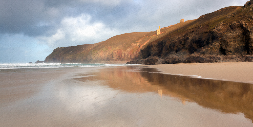
Here is another example taken at Chapel Porth on the same day. Again the conversion is subtle with the original shown first:
This set is perhaps less subtle: the original image; the original cropped; the simplified and textured version; and a new composition that was deliberately overexposed to mute the contrast and colours before simplifying and adding texture:
The amount of simplification, altered colouration and added texture depends upon the subject matter. The aim is to not make the processing so obvious that it becomes the subject. Any changes should enhance the picture. Of course, it is not normal to present a choice of the original or the processed painterly version so it is accepted if the original is the preferred by some viewers (it is also recognised that viewing small digital versions is limited and that full sized or printed copies can look very different).
There is no real objective criteria for selecting an image to convert into the painterly style. It is more of a feeling that it might work. For example, this is an image taken at Perranporth in Cornwall. The image has a natural soft definition due to the weather conditions. The appeal is the line of wet sand converging towards the cliffs in the background.
The foreground is actually quite distracting and although I like the shape of the clouds a better composition for these purposes is achieved with a top and bottom crop.
Using blur and adding texture subtly alters this image to give it a painterly finish. Whether this is an improvement depends upon individual taste.
This is a slightly brighter version:
Here is another example taken at Chapel Porth on the same day. Again the conversion is subtle with the original shown first:
This set is perhaps less subtle: the original image; the original cropped; the simplified and textured version; and a new composition that was deliberately overexposed to mute the contrast and colours before simplifying and adding texture:
The amount of simplification, altered colouration and added texture depends upon the subject matter. The aim is to not make the processing so obvious that it becomes the subject. Any changes should enhance the picture. Of course, it is not normal to present a choice of the original or the processed painterly version so it is accepted if the original is the preferred by some viewers (it is also recognised that viewing small digital versions is limited and that full sized or printed copies can look very different).
Labels:
Blur,
Cornwall,
Crop,
Painterly,
Perranporth,
Photo Art,
Porth Chapel,
Simplification,
Texture
Location:
Perranporth, Cornwall, UK
Tuesday, 17 May 2016
Best of the Rest - Photography Week 16 (2016)
These are a selection of other photographs taken during photography week 16 (18th to 24th April 2016):
Trevellas Porth
After a walk along the South West Coastal Path we stopped at Trevellas Porth near St Agnes for the sunset. With a fairly high tide the compositions were limited. The best shot was this golden light on a wet rock:
Just before sun dipped below the cloud line I captured this shot into the light:
Glendurgan Gardens
We spent a pleasant Sunday afternoon looking around Glendurgan Gardens:
At the end of the gardens there is access to the beach at Durgan:
Wooden Door
Can't resist old wooden doors and rusty hinges:
Tehidy Trees
Whilst in Tehidy this week looking at bluebells I also spotted the contrast between the grey/silver trees and the rustic coloured thicket:
Photo Art
Football on the beach. I have used colour reduction, blur and textures to give a painterly finish to this scene:
Steps in Falmouth:
Falmouth
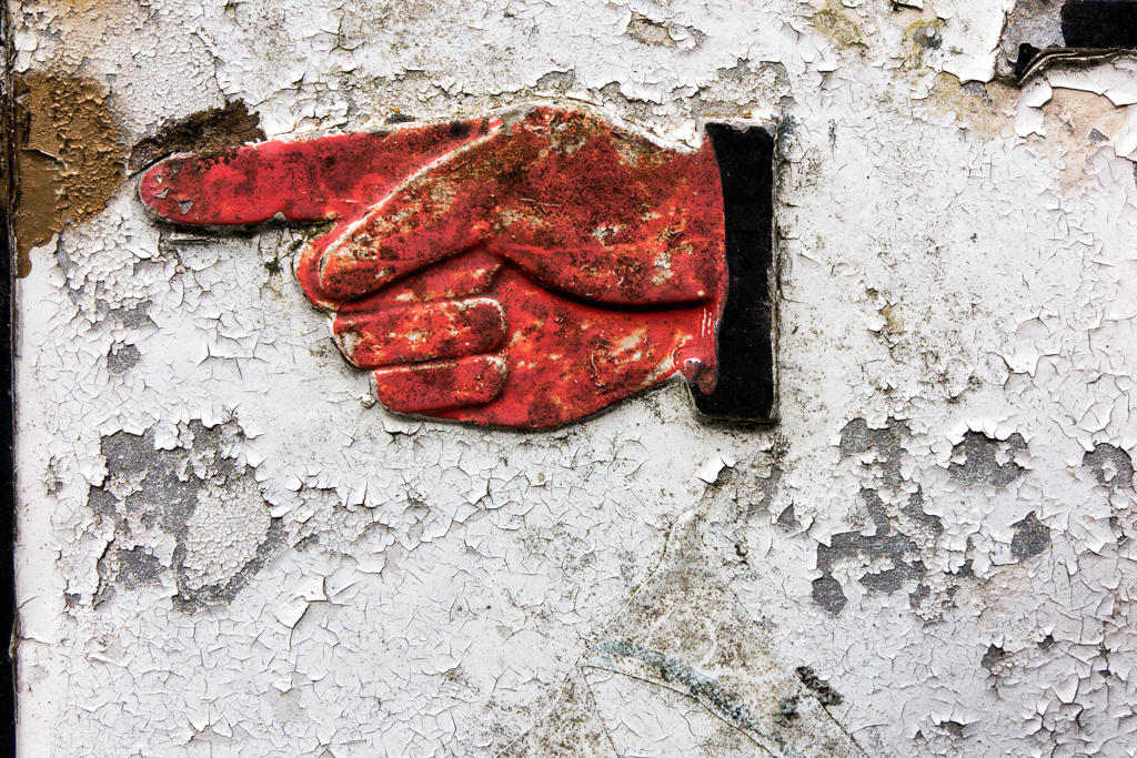
These are some odd bits around Falmouth taken during the week: street names with a helpful pointing finger; sea water covered steps; and a church slate roof.
Trevellas Porth
After a walk along the South West Coastal Path we stopped at Trevellas Porth near St Agnes for the sunset. With a fairly high tide the compositions were limited. The best shot was this golden light on a wet rock:
Glendurgan Gardens
We spent a pleasant Sunday afternoon looking around Glendurgan Gardens:
At the end of the gardens there is access to the beach at Durgan:
Wooden Door
Can't resist old wooden doors and rusty hinges:
Tehidy Trees
Whilst in Tehidy this week looking at bluebells I also spotted the contrast between the grey/silver trees and the rustic coloured thicket:
Photo Art
Football on the beach. I have used colour reduction, blur and textures to give a painterly finish to this scene:
Steps in Falmouth:
Falmouth
These are some odd bits around Falmouth taken during the week: street names with a helpful pointing finger; sea water covered steps; and a church slate roof.
Labels:
Cornwall,
Durgan,
Falmouth,
Glendurgan,
Photo Art,
Tehidy Country Park,
Trevellas Porth,
Wooden Doors
Location:
Cornwall, UK
Subscribe to:
Posts (Atom)